Feeling anxious about writing a cover letter? Not sure how to describe your strengths and experiences—and grab a recruiter’s attention while doing so? We’re here to help. We’re going to walk you step-by-step through every aspect of how to write a cover letter, from using the correct format to writing each section of the document. Every cover letter is slightly different depending on the field and personal experience, but there are some general guidelines that everyone should keep in mind when writing one.
This article (Step 1) in our comprehensive cover letter series will help you write a cover letter that is formatted correctly. You’ll move on to steps 2–10 to actually write the letter.
✅ Step 1. Format Your Cover Letter
Step 2–4. Open The Cover Letter With A Proper Header, Greeting, And Memorable Introduction
Step 5–7. Explain You’re Fit For The Job, Add A Call To Action, And End With The Right Sign-off
Step 8–9. Edit And Share Your Cover Letter
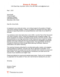
We’ve provided a sample cover letter you can use to follow along in this series and create your own. Click on the image below to expand it. You’ll learn more about the format of this cover letter in this article.
Step 1. Format your cover letter
In general, your cover letter should be formatted like a traditional letter. For an example of this kind of formatting, see our sample cover letter here.
You can also choose to use more creative formats that involve a custom design. However, be cautious when going this route. Some employers use automated technology to scan cover letters, and these bots might not pick up the actual text of the letter if it is lost in the formatting. Further, some employers might prefer a more traditional cover letter format. In fields like marketing or the creative arts, though, a unique format design might be acceptable or even expected.
Whether you pick a traditional or unconventional format, it’s important that you use the same fonts and color palette as your resume.
Fonts
You want to pick a font that is clear, easy-to-read, not too large, and professional. If you don’t know where to start, we have some tips for you about the best fonts for your resume. While Times New Roman used to be the go-to font, it has largely fallen out of favor in recent years (in part because it is considered difficult to read). These days, sans serif fonts are more popular, particularly:
- Calibri
- Helvetica
- Tahoma
- Arial
- Verdana
If you are more traditional and want a serif font like Times New Roman that is easier to read, Garamond is a good choice.
Font size
In a traditional cover letter, all of the text on the page is the same font size. Size 12 font is typical, although in some cases size 10 font may be used.
For a cover letter with a large header, the largest font should be reserved for your name. In these instances, your name may be a size 14–16 font. All of the other body text on the page should be a traditional font size, such as size 12 font.
When writing your cover letter, it is important to use appropriate line breaks and line spacing. These conventions are slightly different from those you might be familiar with from writing class papers or emails.
See how font size and other formatting options make a big difference to resumes as well.
Spacing
Here are the basic guidelines for how to properly space a cover letter:
- Text should be single-spaced.
- Each new paragraph should be separated with a line break.
- There should be two line breaks before and after the date, after the address of the recipient, and after the sign-off.
- The document should be left justified, including the sign-off and signature.
- No indent at the start of each new paragraph.
For an example of this formatting, see our sample cover letter.
Margins
Generally speaking, you want to use 1″ margins for your cover letter. If you are really pressed for space, you can reduce them a bit. However, you don’t want to go smaller than ½” margins, or your cover letter will be difficult to read (and it may not print correctly).
In the United States, cover letters are typically written on 8 ½” x 11″ paper. In the UK and Europe, A4 sized paper is considered standard. For file format for emailing your resume, please see Steps 8–9.
Cover letter design
A cover letter does not have to use a creative design template. However, in some fields like marketing, using creative designs is expected.
When it comes to choosing a cover letter design, the two most important things to keep in mind is that you want it to be clear and readable. Color schemes should be simple, and cluttered design or busy font choices that may be distracting should be avoided.
We are going to go over some of the key elements of writing an introduction to your cover letter.


