Applying for your dream job? We’re here to help. We’re going to walk you step-by-step through every aspect of how to write a strong resume, from choosing a format to writing each section of the document. Every resume is slightly different depending on the field and personal experience, but there are some general guidelines that everyone should keep in mind when writing a resume.
This article (Step 1) in our comprehensive resume series will help you choose the resume format and design that’s best for you. You’ll move on to steps 2–10 to actually write the resume.
✅ Step 1. Choose a Resume Format
Step 2. Include Appropriate Contact Information
Step 3. Write a Stellar Objective
Step 4. Highlight Relevant Experience
Step 5. Add Relevant Skills to Your Resume
Step 6. Include an Education Section
Step 7. List Certifications and Awards
Step 8. Incorporate Action Verbs, Adjectives, and Other Buzzwords
Step 9. Edit Your Resume
Step 10. Share Your Resume
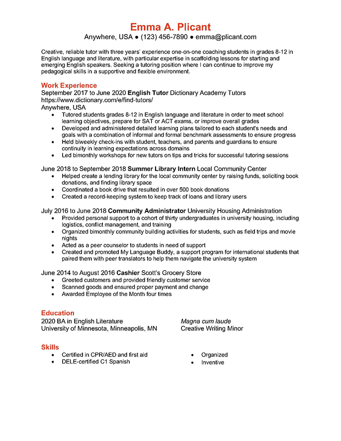
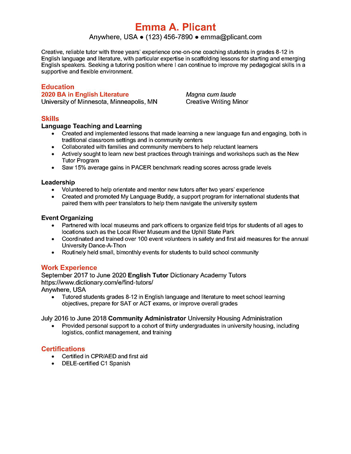
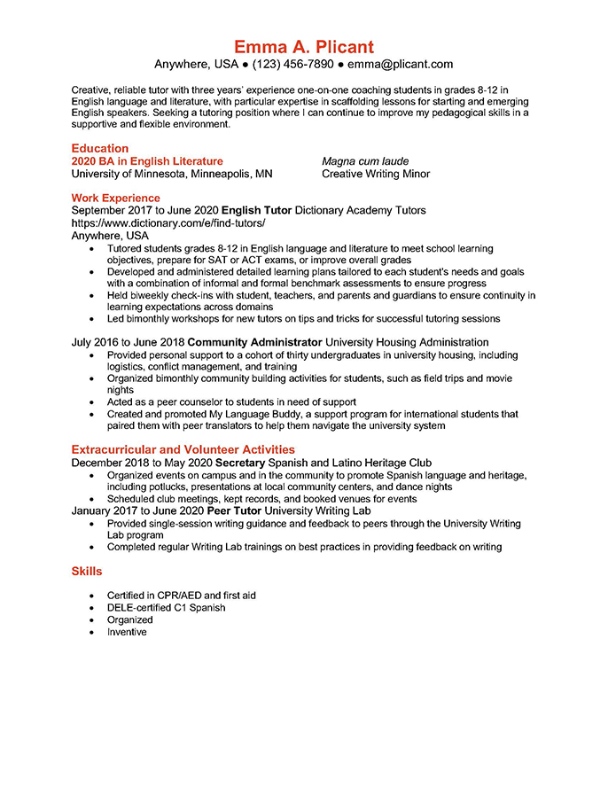
We’ve provided three sample resumes you can use to follow along in this series and create your own format. There are three templates linked here (click on the images below to expand them), but each format is explained in more detail below:
- the chronological resume
- the functional resume
- the combination resume
Step 1. Choose a resume format
Before you begin to write your resume, you need to first choose a resume format. We are going to walk through the benefits and drawbacks of four common resume formats:
- chronological
- functional
- combination
- infographic
The format you choose will depend on your own experience, the job you are applying for, and your capacity for graphic design. For example, if you are applying for a job as a tutor, you may choose to use a chronological resume format. In contrast, if you are applying for a job as a graphic designer, you would likely choose an infographic resume format.
Despite some differences, each of these formats has the same basic components. They are:
- an introduction or objective
- contact information
- education
- work experience
- skills
We will go over each of these elements in a little bit. As we go, we will give you a sense of how these elements are arranged in each of these formats. For now, note that the placement and weight given to each of these elements varies depending on the format chosen.
For most people, choosing a resume design is a matter of using a template offered by one of the many word processing programs (such as Microsoft Word, Google, or Apple Pages, for example). Templates follow the major rules for resume design and offer a lot of opportunities for customization. Others—the graphic designers among us—may choose to develop a custom template. If you’d like to learn more about the specifics of resume design, jump ahead to the section at the end of this article.
The chronological resume
One of the most common resume formats is the chronological resume. Chronological means “arranged in the order of time.” In this format you list your experiences from most recent to least recent (this is known as “reverse chronological order”). On a chronological resume, professional experience is the star. The work experience section will take up a bulk of the page, front and center. In contrast, sections such as skills and education are typically shorter and may be found in the margin or at the bottom of the page.
Pros & cons
If you are applying for a position where it is best for you to emphasize your work experience, rather than skills or design ability, a chronological resume may be a good choice. Someone who has spent a lot of time in the job market may want to use this resume format in particular, as it demonstrates your consistent growth and experience. For example, if the job posting specifically states they are looking for someone with five years of experience in the field, a chronological resume is a good way to show this.
While chronological resumes are popular and common, they may not always be the best fit for everyone. Critically, if you have gaps in your job history, you may not want to use a chronological resume. Hiring managers may be wary of hiring those who have a spotty work history, even if the reasons for employment gaps are reasonable, such as leaving the job market to care for a family member. A chronological resume also would not necessarily be a best choice if you have spent most of your career at only one job or place of employment. Further, chronological resumes aren’t always the best fit for fields like the creative and performing arts or marketing, where demonstrating specific skills and having a robust portfolio is more important than listing every single campaign or event you worked on. If you want to highlight your education and other accomplishments, you might also consider creating a CV (or curriculum vitae). Read our article on the differences between resumes and CVs to learn more.
The functional resume
Rather than focusing on work experience like a chronological resume, a functional resume highlights skills and abilities. The word functional here refers to one’s ability to complete certain tasks or functions (“the kind of action or activity proper to a person, thing, or institution; role”).
In a functional resume format, the skills section takes up most of the page, front and center. Other sections, such as professional experience, are smaller in contrast. They may be found in the margin or bottom of the page.
Typically, you will want to group your skills by type. For example, let’s say you worked as a tax preparer. As a tax preparer, you would have skills in customer management, accounting, and software. Under the heading of skills, you could include each of these skill areas as a subheading. You could also group skills using more general descriptors, such as technical, interpersonal, or sales. You would then describe each of these skill sets in detail and describe how you demonstrated competency in these domains on the job. (We will get more into how to write these descriptions a little further on.)
Pros & cons
A functional resume is often great for job seekers who have only had one or two jobs or have big gaps in their work history, because it focuses less on job experience and more on skills learned. It can also be a good choice for those who are seeking to switch fields. For instance, if you had worked previously in human resources and are applying for a job as an executive assistant, you would want to focus on how the skills you learned as a human resources officer are applicable to the position of executive assistant.
One drawback of the functional resume is that it could imply to some employers that you do not have extensive work experience. For some positions, especially entry-level jobs, this wouldn’t necessarily be disqualifying, but it is good to keep in mind.
The combination resume
Maybe you have some great work experience and you have developed many desirable skills over the years, and you want to highlight both. In this case, you may want to use a combination resume format. As you may have guessed, this resume format blends work experience and skills in the main body of the text.
A typical combination resume format first lists skills. In contrast with a functional resume format, the skills section of a combination resume format may not have subheadings and will have shorter descriptions. Following the skills section is a typical reverse-chronological work history (starting with most recent). Education and other sections are generally short and may be placed in the margins or at the bottom of the page, as in the other example formats we have seen.
Pros & cons
Combination resumes are a good fit for a variety of people and situations, making it a popular resume format. If you are a new graduate applying for your first career-focused job, this format may be particularly beneficial for you, because it allows you to highlight the skills you learned throughout your education as well as demonstrate any internships or other work experience you may have.
While the combination resume format is an effective fit for most situations, it might not be right for everyone. Someone with extensive relevant work experience may not want to use the combination resume format because they should highlight experience rather than skills. Again, the resume you use depends on the job you are seeking!
The infographic resume
The last resume format stands out from the others in terms of layout and style. It is known as an infographic resume format. An infographic is “a visual presentation of information in the form of a chart, graph, or other image accompanied by minimal text, intended to give an easily understood overview.” An infographic is an eye-catching, simple snapshot of some information.
Unlike other resume formats, information doesn’t have to be arranged in any particular order or given a specific kind of focus. The look and format is highly creative and tailored to each person. The point of an infographic resume is to stand out from the crowd, meaning the sky’s the limit when it comes to design. Because these resumes vary widely based on job and professional field, we have not included an example in this overview.
Pros & cons
Infographic resumes are often found in creative fields, such as graphic design, marketing, or public relations. They can help your resume stand out in the stack. Infographic resumes are also great additions to your online presence, such as a professional website or LinkedIn profile. Essentially, infographic resumes are best for jobs or workplaces that prize creativity.
Perfect your LinkedIn profile with this guide on writing a catchy LinkedIn summary.
That said, many employers may still prefer more conventional resumes. Another major challenge when it comes to infographic resumes is that they may not be machine-readable, meaning that it may be hard for a software program (which many employers use as an initial screen of applicants) to glean information from this resume format. You don’t want to be overlooked because the software didn’t pick up on all of the details you have provided. When applying to small businesses or creative industries, however, this may not be an issue.
Resume design
When it comes to choosing a resume design, the two most important things to keep in mind is that you want it to be clear and readable. Often, the color scheme will be simple—black and white, possibly with gray or navy. Beyond that, you can be somewhat creative. However, you don’t want to choose an overly busy design or font choices because the look may be distracting. You also want to keep in mind that using complex images might make it harder for your resume to be machine-read. The one exception to this is if you’re using an infographic resume format, where you want to show off your creative chops.
We are going to go over some of the key design elements to keep in mind when working on your resume.
Resume template
If you don’t have strong design skills, you might opt to use a pre-made resume template. You can find resume templates online or using word processing programs like Microsoft Word. Look around until you find one that is a good fit for your experience and the job posting you are applying for.
Resume style
When it comes to your resume style, there are some elements that are fairly standard. These guidelines help keep your resume design clear and readable. We are going to go over the fonts, spacing, margins, and length guidelines for a strong resume.
You want to pick a font that is clear, easy-to-read, not too large, and professional. If you don’t know where to start, we have some tips for you about the best fonts for your resume. While Times New Roman used to be the go-to font, it has largely fallen out of favor in recent years (in part because it is considered difficult to read). These days, sans serif fonts are more popular, particularly:
- Calibri
- Helvetica
- Tahoma
- Arial
- Verdana
If you are more traditional and want a serif font like Times New Roman that is easier to read, Garamond is a good choice.
Font size
The largest font size should be reserved for your name. Depending on the style of resume you have selected, your name might be size 14–16 font. All of the other text on the page should be size 12 font or smaller.
Here are some general guidelines, which you should adapt to the font and layout of your resume:
- Headings: size 12 font
- Sub-headings: size 11 font
- Bullet points: size 10 font
While you can make the font small, be careful not to make it too small. Remember—the goal is for the text to be clearly readable.
Font styles
Using font styles such as bolding and italics can be a good way to differentiate different kinds of information you use in your resume. For example, it is generally a good idea to use bold text for the headings and subheadings. Italics can be used sparingly, for dates for example, if it works for your resume design. However, underlining text is uncommon on resumes. It should be avoided. Whatever pattern you use for your font styles, the most important thing is to be consistent.
Spacing
Spacing is one of the most deceptively challenging things about writing a resume because you have to fit a lot of information into a relatively small space. That said, you do want to include a line break between the end of one section and the beginning of another. This helps keep your resume clear and readable.
Otherwise, you will likely want to use 1 or 1.15 space for most of the text in your resume. After all, you have limited space!
Margins
Generally speaking, you want to use 1″ margins for your resume. If you are really pressed for space, you can reduce them a bit. However, you don’t want to go smaller than ½” margins, or your resume will be difficult to read (and it may not print correctly).
In the United States, resumes are typically written on 8 ½” x 11″ paper. In the UK and Europe, A4 sized paper is considered standard.
Appropriate resume length
Because it is a summary of your work experience, a resume is typically only one page long, although a 2018 study suggested that two-page resumes are becoming more acceptable. Those with 5–10 years of experience in a field, may opt to fill a two-page resume.
